Helvetica
typeface (1957)
Helvetica is a typeface designed by Max Miedinger in 1957, created by Eduard Hoffmann, director of the Swiss foundry Haas in Münchenstein. The name derives from Helvetia, the Latin name of Switzerland.
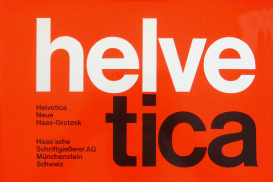
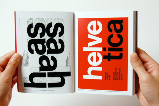
Miedinger, a former freelance designer from Haas, is in charge of designing a new "without graces" (sans serif) character to lift the company's fate and counter the international success of the Akzidenz Grotesk character, of the concurrent printing company H. Berthold AG.
In reality, the new character, originally called Neue Haas Grotesk, owes much to the character that seeks contrast and which will soon replace in favor of graphic designers, communication agencies and their clients.
The complete Helvetica font series was introduced to the market in 1961 by the German companies Stempel and Linotype.
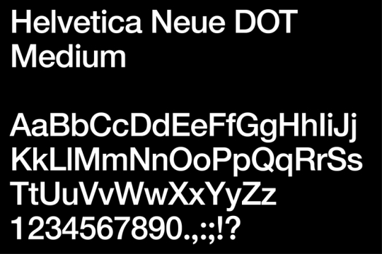
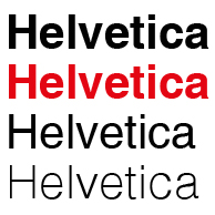
Over the years, a wide range of variants have been released in different weights, widths and sizes. Helvetica, as originally designed, has the termination of strokes on horizontal or vertical lines and a narrow spacing between the letters that combine to give it a dense, compact and modern look.
His becomes the hallmark of the international typographic style emerged from the work of Swiss designers in the late 50s and 60s, becoming one of the most popular typographic characters of the twentieth century and destined to last.
Helvetica has great success in advertising agencies that use it for its customers in a period of great ferment in the field of graphics and communication of business and visual more in general. Many company and product brands (logos) are made with Helvetica, as well as road signs and transport systems.
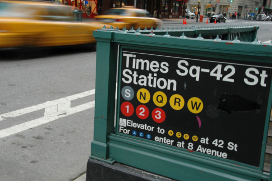
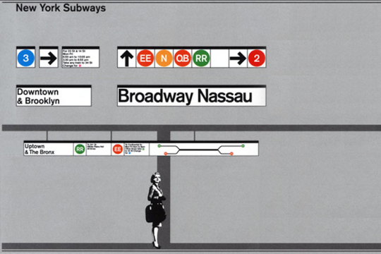
At the end of 1989, the character Helvetica, for the intervention of Massimo Vignelli, becomes the official typeface for all the signs of New York, from road signs to the subway and railway system signs to the city maps, replacing the previous Standard ( Akzidenz Grotesk).
In 1984 Helvetica is inserted among the fonts used by the Macintosh system, favoring its great diffusion and success also in digital graphics.
The characteristics of Helvetica are its elegance and a certain neutrality, as well as its legibility, which allow it to be applied in brands and in communication of the most varied production and business fields, in brands (logos) and in communication in the most varied sectors.
Some famous brands that use Helvetica in their logo:
3M, Agfa, Agip, Aprilia, Basf, BMW, BP, Cassina, Caterpillar, Epson, Fendi, Harley Davidson, Hitachi, Hoover, Jeep, Kappa, Kartell, Kawasaki, Knoll, LG, Lufthansa, Mattel, Microsoft, Mitsubishi, Motorola , Nestlé, Olympus, Pan Am, Panasonic, Parmalat, Saab, Sanyo, Superga, Tetrapak, The North Face, Toyota and of course the Swiss Federal Railways.
A feature film directed by Gary Hustwit was published in 2007 coinciding with the 50th anniversary of the introduction of the Helvetica typeface in 1957.