

Bob Noorda
graphic designer (1927 - 2010)
Bob Noorda was born in Amsterdam on July 15, 1927. He studied at the IvKNO (Instituut voor Kunstnijverheidsonderwijs, now the Gerrit Rietveld Academie) in Amsterdam, graduating in 1950. His education was strongly influenced by the Bauhaus, which shaped his minimalist and functional approach to design.
After military service in Indonesia, he began his freelance career in Amsterdam until 1954, when he moved to Milan. There, he worked in various fields of visual design, distinguishing himself for his rigor and visual synthesis.
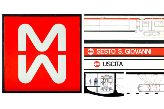
Professional, Bob Noorda established himself in Italian graphic design in the 1960s, collaborating with clients such as Pirelli, where he was art director from 1961, Olivetti, La Rinascente (1963-1964), Mondadori, Enel, Algida, and Coop. He designed the graphics and signage for the Milan Metro, inaugurated in 1964, a work that marked a milestone in Italian graphic design and earned him the Compasso d'Oro.
In 1965, he founded and served as vice president of Unimark International, an agency with offices in Milan and New York that promoted the idea of corporate identity as a fundamental discipline in corporate design.
Among his awards, Bob Noorda received the Compasso d'Oro four times (1964, 1979, 1984, 1994), two Bodoni Prizes for publishing, and the gold medal for corporate identity at the Ljubljana Biennale. In 2005, he received an honorary degree in Design from the Polytechnic University of Milan.
He teaches graphic design at prestigious institutions such as the School of Industrial Design in Venice, ISIA in Urbino, the Società Umanitaria, and the Polytechnic University of Milan, training new generations of designers.
Bob Noorda is one of the most innovative graphic designers of the twentieth century: he introduced modern graphics to Italy, with a clear, functional language free of superfluous decoration. He created iconic logos and signage systems, such as those for the Milan Metro and the Eni logo (the six-legged dog), still in use today.
Main clients and projects:
Pirelli (art director since 1961)
La Rinascente (1963-1964)
Olivetti (various graphic projects)
Milan Metro (signage and visual design, 1964)
Mondadori, Enel, Algida, Coop (corporate identity)
Founder and vice president of Unimark International (1965)
Corporate identity for companies:
Agip, Banca Commerciale Italiana, Dreher, Chiari e Forti, Fusital, MaxMeyer, Richard-Ginori, Total, Zegna, Mitsubishi, Rex, and Zoppas.
Logo designs and redesigns:
Coop, Arnoldo Mondadori Editore, Messaggerie Italiane, Automobile Club d'Italia, Enel, Eni, Montedison, Aem, and Hera, as well as the coat of arms of the Lombardy Region (the latter, along with Bruno Munari, Pino Tovaglia, and Roberto Sambonet). Exhibitions have been dedicated to him around the world.
His impact on the history of graphic design lies in his ability to combine functionality and visual clarity, cementing the role of graphic design as an essential discipline in the Italian and international industrial and cultural context.
Bob Noorda stands out for his approach to design based on very clear and rigorous principles: simplicity, functionality, and clarity are the cornerstones of his work. For him, design is at the service of the user, with the goal of ensuring that every visual message is immediately understandable and intuitive, without decorative frills or superfluous elements. This minimalist philosophy, rooted in his training at the Gerrit Rietveld Academy in Amsterdam and influenced by the Bauhaus, leads him to use clean forms, precise geometries, sans-serif typefaces, and asymmetrical yet balanced compositions that communicate effectively and with great visual force.
Stylistically, Noorda works as a craftsman in the finest sense of the word: he attends to every detail with sensitivity and rigor, redefining graphic design as a profession in its own right, distinct from illustration or painting. His creative process involves paring elements to the essential, yet without sacrificing expressive power. His works, such as the famous signage system for the Milan Metro—created in collaboration with Franco Albini and Franca Helg—clearly demonstrate this attention: the use of a continuous opaque red band, the lettering legible from the carriage, everything is calibrated to facilitate orientation and ease of use, also becoming a symbol of urban modernity.
In this signage, as in his projects for major companies (Pirelli, Olivetti, La Rinascente, Eni), his sober yet elegant style emerges, a balance between standardization and artisanal taste. Noorda is not only a designer but also a recognized visual identity strategist (corporate identity), anticipating modern branding concepts, where every graphic element contributes to the recognizability and coherence of the corporate image.
Unlike many of his contemporaries, Noorda eschews unnecessary decoration, aiming for a direct yet aesthetic visual language that stands the test of time—a design concept that maintains freshness and relevance even after many years.
In summary, Noorda's work is characterized by:
Absolute functionality: every element serves a specific purpose; nothing is superfluous.
Clarity and legibility: the visual message must be accessible to everyone, immediate, and unambiguous.
Formal simplicity: the use of simple geometric shapes, linear fonts, and grids to organize content.
Rigor and craftsmanship: obsessive attention to detail and adherence to solid compositional principles.
Innovation in branding: a pioneer in creating coordinated visual identities for companies and institutions.
Lasting impact: a design that stands the test of time while maintaining freshness and aesthetic validity.
Bob Noorda is a key figure who transformed Italian graphic design from a decorative activity to a modern and rigorous discipline, laying the foundation for contemporary visual communication. He rests, buried in the crypt of the Famedio, in the Monumental Cemetery of Milan.